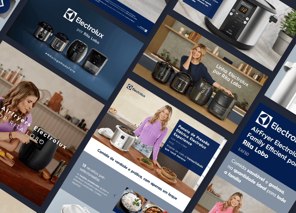
Experiência digital para a linha Rita Lobo + Electrolux
Criei landing pages promocionais para a linha Electrolux por Rita Lobo, unindo design responsivo, integração visual com a marca e foco na usabilidade. O projeto priorizou conversão e uma navegação fluida, respeitando o universo visual da chef e os padrões de guide da Electrolux, reforçando a presença digital com sofisticação e empatia.
Ottawa, Ontario, Canada
2006
E-commerce
$1.578 billion (2019)
5,000+
Challenge
Neste projeto, colaborei com a Electrolux como parte da equipe de ISEE – Criação, Gestão e Distribuição de Conteúdo de Produtos – no desenvolvimento das landing pages promocionais da linha de produtos em parceria com a chef Rita Lobo. A iniciativa teve como foco apresentar os diferenciais da coleção dentro do e-commerce da marca, alinhando performance e identidade visual. Fui responsável por criar interfaces atraentes, funcionais e responsivas, integrando elementos do universo visual da Rita Lobo ao guide da Electrolux. O conteúdo foi desenvolvido para destacar as funcionalidades dos produtos e proporcionar uma experiência de navegação fluida, acessível e orientada à conversão. Esta colaboração me permitiu unir estratégia, design e usabilidade em um projeto que reforça a presença digital da marca com sofisticação e empatia.
Results
Post-redesign, user engagement significantly increased with a 25% reduction in task completion time and a 30% decrease in user error rates. User satisfaction ratings improved from 3.2 to 4.6 stars. The streamlined workflows and modern interface resulted in a 20% increase in new subscriptions within the first six months of the launch.
35%
Improved onboarding process
25%
Increase in user retention
84%
Increase in time spent on website


Process
Research & Analysis: We conducted user interviews, surveys, and analyzed in-app analytics to understand the pain points and user needs. We also studied competitor apps and industry trends to gather insights
Information Architecture: Based on the research findings, we restructured the app's navigation and content, prioritizing features and information according to user needs.
Wireframing & Prototyping: We designed low-fidelity wireframes to visualize the new layout and navigation, iteratively refining them based on user feedback. Afterward, we built a high-fidelity, interactive prototype to test the design.
Usability Testing: We conducted usability tests with a diverse group of users to validate the design and identify areas for improvement. Based on the feedback, we made necessary adjustments to the design.
Visual Design & Style Guide: We developed a cohesive visual language, including color schemes, typography, and iconography, ensuring consistency throughout the app. We also created a style guide to maintain design consistency in future updates.


“ With our new visual branding and language in place, the new Shopify brand clearly captures the essence of our current and target customer base, our employees, and our values. ”
Tobias Lütke
CEO, Co-founder | Shopify


Conclusion
The modernization of the subscription management platform successfully addressed the core usability issues and improved the overall user experience. By focusing on simplifying the interface and optimizing workflows, we were able to create a more efficient and enjoyable platform for users. The significant improvements in user engagement, satisfaction, and subscription rates underscore the importance of user-centric design in achieving business success.